L'eto Design System
A token, component and governance layer extracted from a live medical aesthetics and dental site I designed and built end to end.
A system underneath a finished site
L'eto Clinic is a doctor-led medical aesthetics and dental clinic in London. I designed and built the site end to end in Webflow, first as an original build and then as a full redesign that is the live product today.
Both versions were built intuitively. There was no formal design system underneath either of them, and for a single site built by one person that worked. It stopped working when a second sub-brand, L'eto Dental, launched on the same foundations.
So the system came after the build, not before it. I had a finished, working product and needed to find the rules it was already following, name them, and fix the places where it was quietly following none.
Diagnosing my own work
I audited my own work, one version against the next, and then the live site against itself.
Drift is what happens to every product that grows. The point of an audit is not to find fault, it is to locate every place where a decision was implied but never recorded, and then record it.
Every figure in this section was measured from the live site using the browser's computed styles, not eyedropped from screenshots.
The primary action, booking, is worded eight different ways across the site. These were collected from 16 of 129 indexed pages, so the true count is likely higher.
Capitalisation is inconsistent across the set: title case, sentence case and all-lowercase all appear for the same action.
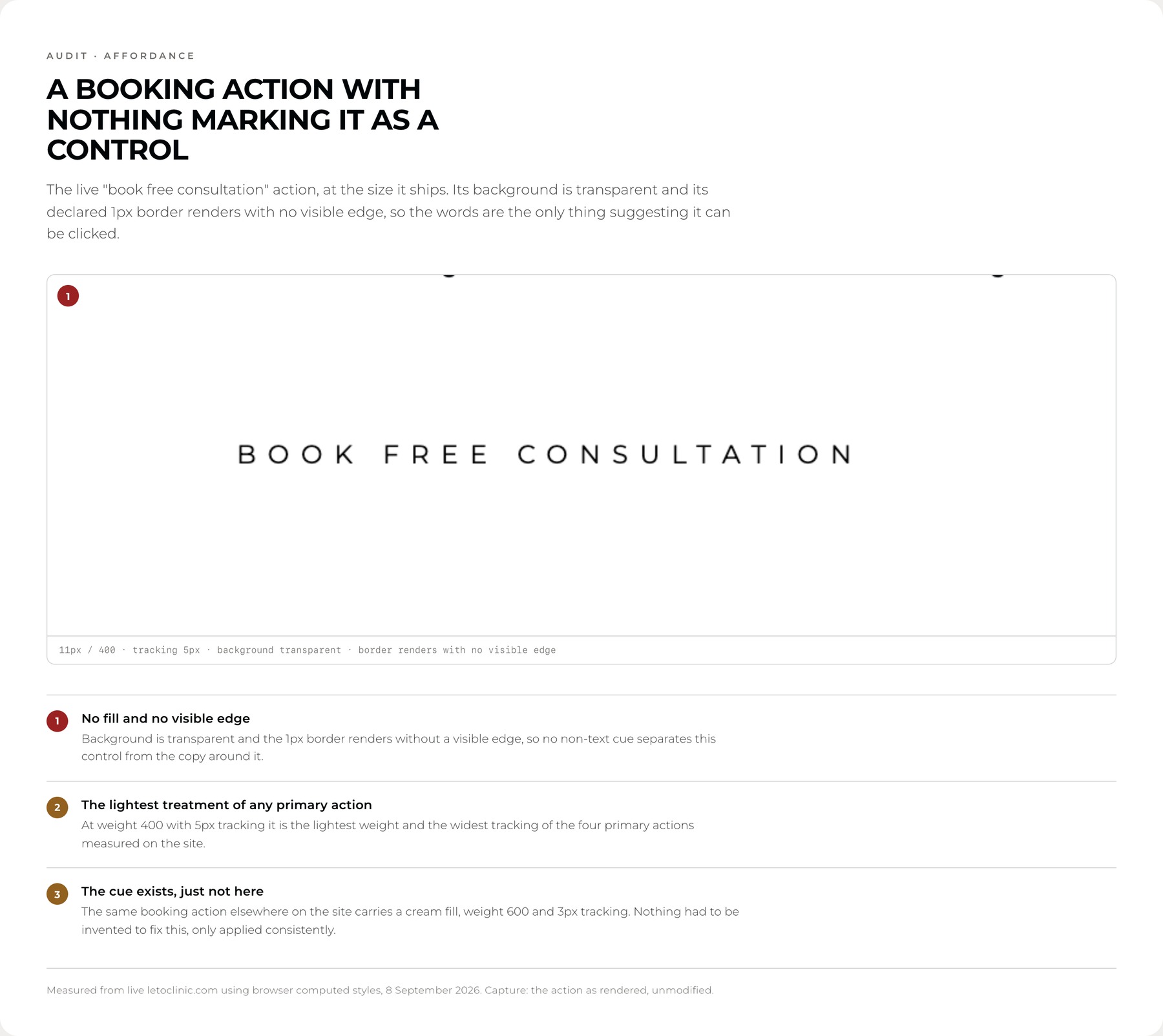
On the home page alone that action is rendered as four different components. Reproduced here at their measured values:
Three font sizes (10, 11, 12px), two weights (400, 600), two letter-spacings (3px, 5px), two radii (100px, 0px), and four different fill and border treatments. The fourth is set in the same size, weight, tracking and colour as the section label above it, so it carries no affordance distinguishing it from static text.
The site's own stylesheet already defined colour variables, but named for appearance rather than for the job they do. Measuring every colour actually in use surfaced four near-identical near-blacks, applied interchangeably.
#03060847 uses#00000017 uses#1313139 uses#04080c1 useAnd two near-identical golds, one used for text and one for fills, neither of them the same value:
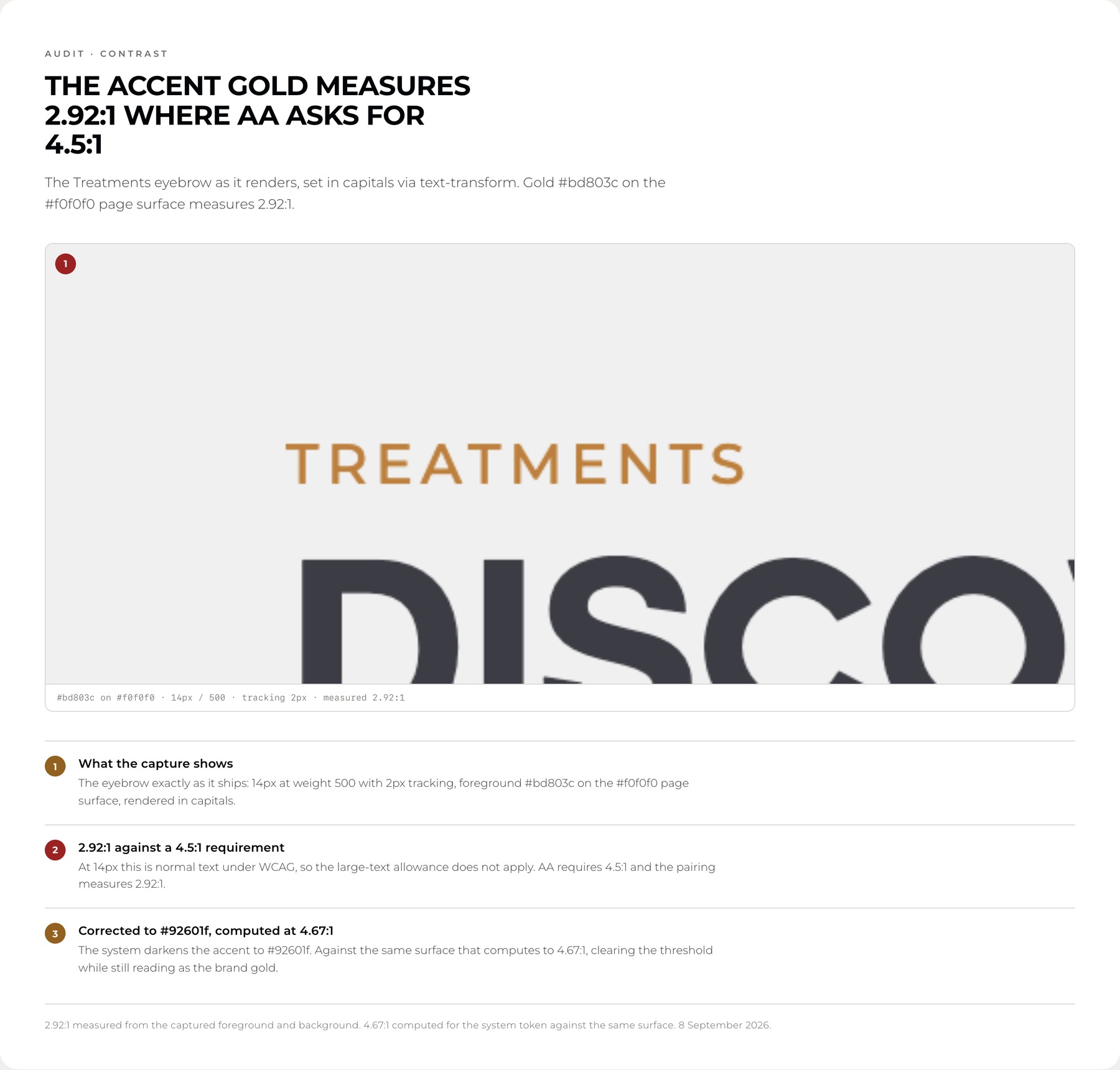
#bd803ctext#c89958fillsThe gold used for eyebrow labels measured 2.92:1 against the page background. WCAG AA requires 4.5:1 for normal text, and these are small letter-spaced capitals, so the large-text exemption does not apply.
The corrected gold stays recognisably the brand gold while clearing the threshold. The corrected label grey clears AA at 4.61:1 while staying visibly lighter than body copy, so the hierarchy survives the fix.
The contact form collects four fields and not one of them is programmatically labelled: no label element, no aria-label, no aria-describedby. The visible Name, Email and Message headings sit above the inputs without being connected to them, so each field's only accessible name is its placeholder, which clears the moment someone types. The message field still carries its unedited default, "Example Text".
There is no helper text, and no error colour appears anywhere in the measured palette, so the site carries no error state of its own and leaves validation to the browser. On a site where people enter contact details to book a medical consultation, that was the highest-cost gap I found.
One claim I had to withdraw. I went in expecting to find no focus treatment, and measured the opposite: the field border shifts on focus to 4.29:1 against the input, clearing the 3:1 that WCAG asks of a non-text indicator. It is in the audit because I measured it, not because I assumed it.
Montserrat throughout at 9–13px for labels, in weights 400, 500 and 600, with letter-spacing between 2px and 5px. Weight, colour and tracking vary section to section with no defined role system, so the same visual rank is expressed several different ways.
Measuring padding, margin and gap across the live site surfaced a dominant 4pt rhythm · 16, 24, 36 and 100 account for most of the layout · which is not the 8pt grid I would have assumed. Genuine drift sits alongside it at 2, 6, 9, 10, 14, 15 and 18px.


Two tiers, built as Figma variables
Primitives are named for what they are and hold raw values. Semantics are named for what they do and hold no values of their own, each one aliased to a primitive. Components bind to semantics only.
A brand change touches one layer and cascades cleanly. Nothing downstream needs to know what colour it is actually getting.
Components
Bind to semantics only. Never to a primitive, never to a raw value.
Semantics
Named for the job. Hold no values of their own · each is an alias.
Primitives
Named for what they are. The only layer holding raw values.
Why two collections, not one
Primitives and semantics live in separate Figma collections, because Figma sets variable modes per collection and the multi-brand work needs modes on the semantic layer only. The accent should resolve differently for Clinic and Dental. The base ink should not.
Measured, not guessed
Every value was measured from the live site using the browser's computed styles rather than eyedropped from screenshots. That is what surfaced the 4pt spacing grid the site actually uses, and the radii it already had: 10px for small tiles, 22px for cards, fully rounded for buttons.
Six components, depth over breadth
Button, Icon Button, Treatment Card, Eyebrow, Input Field, Footer Link.
Chosen to cover every property type Figma offers rather than to reproduce every element on the site. Each specimen below is live: it is rendered from the same tokens documented above, not screenshotted.
Button
The Button replaces eight wordings and four styles with one component carrying a text property, so the label is editable per instance and no one needs to draw a new button to change a word.
The governance rule sits alongside it: the booking action always reads "Book a Consultation". The component removes the technical excuse for inconsistency; the written rule removes the permission.
Input Field
This is the component I would point at first. Its error state signals three ways at once: a red border, a warning icon, and a written message describing the problem. Around one in twelve men has some form of colour vision deficiency, for whom a red border alone communicates nothing.

IV Nutrient Therapy
A clinician-led infusion for hydration and recovery.
Eyebrow
06 Specialties11 Treatments
Bound to --accent or --text-muted, both AA-safe on the page surface.
Footer Link
Book a ConsultationContact
Hover state introduced. The live site's footer navigation had none.
Specified, not reviewed afterwards
Accessibility is specified in the system rather than applied afterwards, so meeting it is the default rather than a review step.
The corrected label grey clears AA at 4.61:1 while staying visibly lighter than body copy, so the hierarchy survives the fix. The corrected gold clears at 4.67:1 and still reads as the brand gold.
Focus states use a thicker, darker border rather than a subtle tint.
Borders that define the edge of an interactive control bind to a different token from hairline dividers, because a divider and a control boundary have different contrast requirements. --border-subtle is grey-200 and carries no contrast obligation. --border-control is grey-400 and does.
One rule came out of measuring, and then proved itself twice. Grey-400 clears AA on the page surface at 4.61:1 but drops to 4.01:1 on the sand card fill. The accent gold does the same thing, clearing at 4.67:1 on the page and falling to 4.06:1 on sand.
So a token that is safe in one place is not automatically safe in another, and the system has to record which is which. Body text and eyebrows inside cards bind to grey-700, not to grey-400 or the accent.
I found the second half of that rule by auditing this page. The treatment card specimen further up originally used a gold eyebrow on the sand fill and failed at 4.06:1. The fix was a binding rule rather than a second gold, because adding a near-identical colour to solve one placement is the exact problem this system was built to remove.
Extracted, or introduced
Most of the system was extracted from the live site. A smaller set of things the site did not have were introduced, and it matters which is which.
| Change | Type |
|---|---|
| Label grey darkened | Correction for AA contrast |
| Accent gold darkened, #BD803C → #92601F | Correction for AA contrast |
| Two label greys consolidated to one | Consolidation |
| Four near-blacks consolidated to one | Consolidation |
| Two golds consolidated to one | Consolidation |
| Error colour and error state | Introduced the site had none |
| Form helper and error messaging | Introduced the site had none |
| Hover state on footer navigation | Introduced |
| Spacing scale extended at small end | Extension of measured values |
Everything else, including all remaining colour values, type roles, spacing, radii and component structure, was measured from the live site rather than invented.
Built, not designed from scratch
The purpose of the system is that a new surface can be built rather than designed from scratch.
L'eto Dental is the test case. It shares the clinic's structure, typography, spacing and component set, and differs in brand accent. In this system that difference is a single variable mode: the same token names resolve to different accent values per brand.
Components bind to the accent role, not to a colour, so nothing is duplicated, restyled or forked to serve the second brand.
Clinic
The same eyebrow and the same button, resolving the accent role to the clinic gold.
06 Specialties --accent → base/goldDental
Identical component instances. One mode switch, no duplication, no forked styles.
06 Specialties --accent → base/tealThe Dental accent shown here is indicative. Swap it for the final brand value and every component instance updates with it.
In my own words
I built this site twice before I built a system for it. That order was not a mistake, but it did have a cost.
Working alone, intuition scales further than people tend to admit. I could hold the whole site in my head, so I never had to write anything down. The system only became necessary when L'eto Dental arrived, and a second brand needed the same answers I had been keeping to myself.
Auditing my own work was the uncomfortable part and the useful one. It is easy to look at drift and see failure. What I actually found was a set of decisions I had made correctly and repeatedly without ever recording them. The 4pt rhythm was already there. The radii were already consistent. What was missing was not judgement, it was a written record of judgement.
The habit I am taking forward is measuring instead of remembering. I went into this audit certain the contact form had no focus treatment, and the measurement said otherwise: it clears the contrast threshold comfortably. Had I trusted my memory I would have published a confident, specific claim about my own work that was simply wrong. The same lesson arrived again when a token that passes on one surface turned out to fail on another, and again when I found the accent gold failing where I had assumed a grey was the culprit.
The system has not made me a better designer. It has made my decisions legible, to whoever comes next and to me.
Want to see the system itself?
The Figma file holds the full variable collections, the component library and the written governance rules.